The task
A pizzeria that sells through an aggregator pays a commission on every order and never sees the customer. Its own ordering site keeps both, as long as it is as quick to use as the app the customer already has.
So the goal was set by the big chains: the menu opens straight away, choosing a size and toppings happens in a window over the page, and the cart never sends anyone to a separate screen. Dark theme, large photos, everything readable on a phone.
What we built
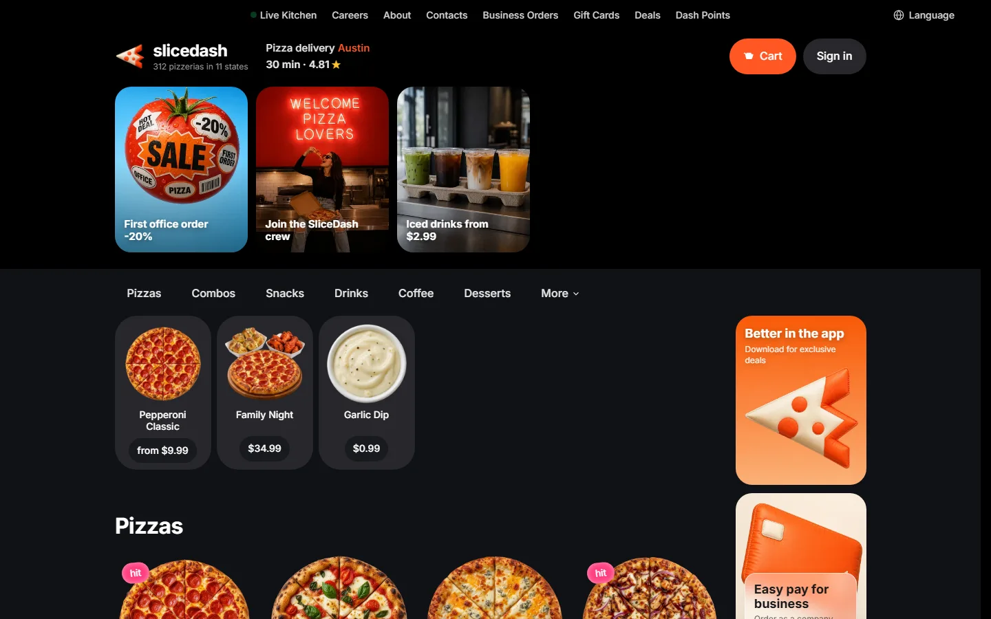
The first screen: city, delivery time and the menu tabs
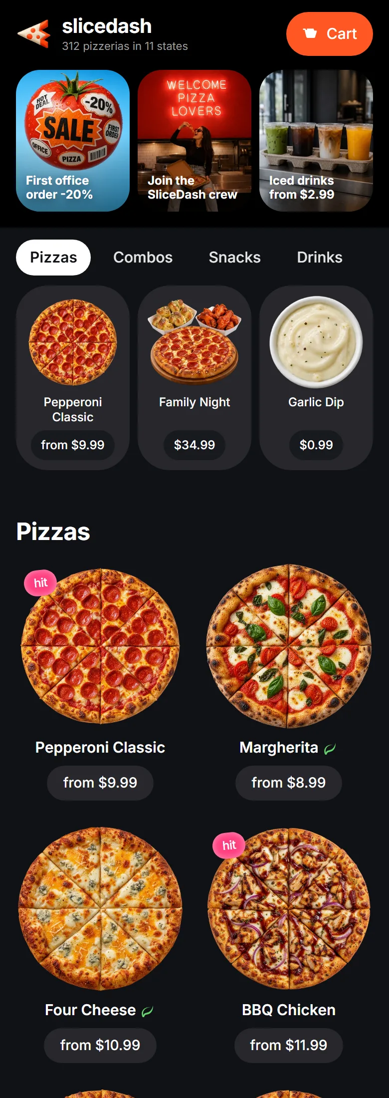
The header carries the things a hungry visitor checks first: the city the kitchen delivers to, the delivery time the brand promises, the rating, the cart and sign-in. Three promo tiles sit under it for the current offers.
Below them the category tabs stay pinned to the top of the window: pizzas, combos, snacks, drinks, coffee, desserts. Tapping one scrolls the catalogue to that block instead of loading a page.
The catalogue and the pizza card
Pizzas fill the grid four across, each with a photo, a name and a price from. Badges mark the ones the kitchen wants moved: hit, new, best price. Marks for spicy, vegetarian and kids sit next to the name.
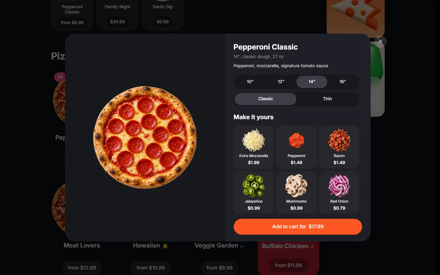
A click opens the card over the catalogue. Size from ten to sixteen inches, classic or thin dough, six toppings with their own prices, and a button that already shows what the pizza costs as chosen.
The rest of the menu and the cart
Pizza alone does not make an order worth delivering, so the catalogue runs on: combos, snacks, drinks, coffee, desserts, sauces. Every block shares one grid and one card layout, and a new category is a data entry rather than a new page.
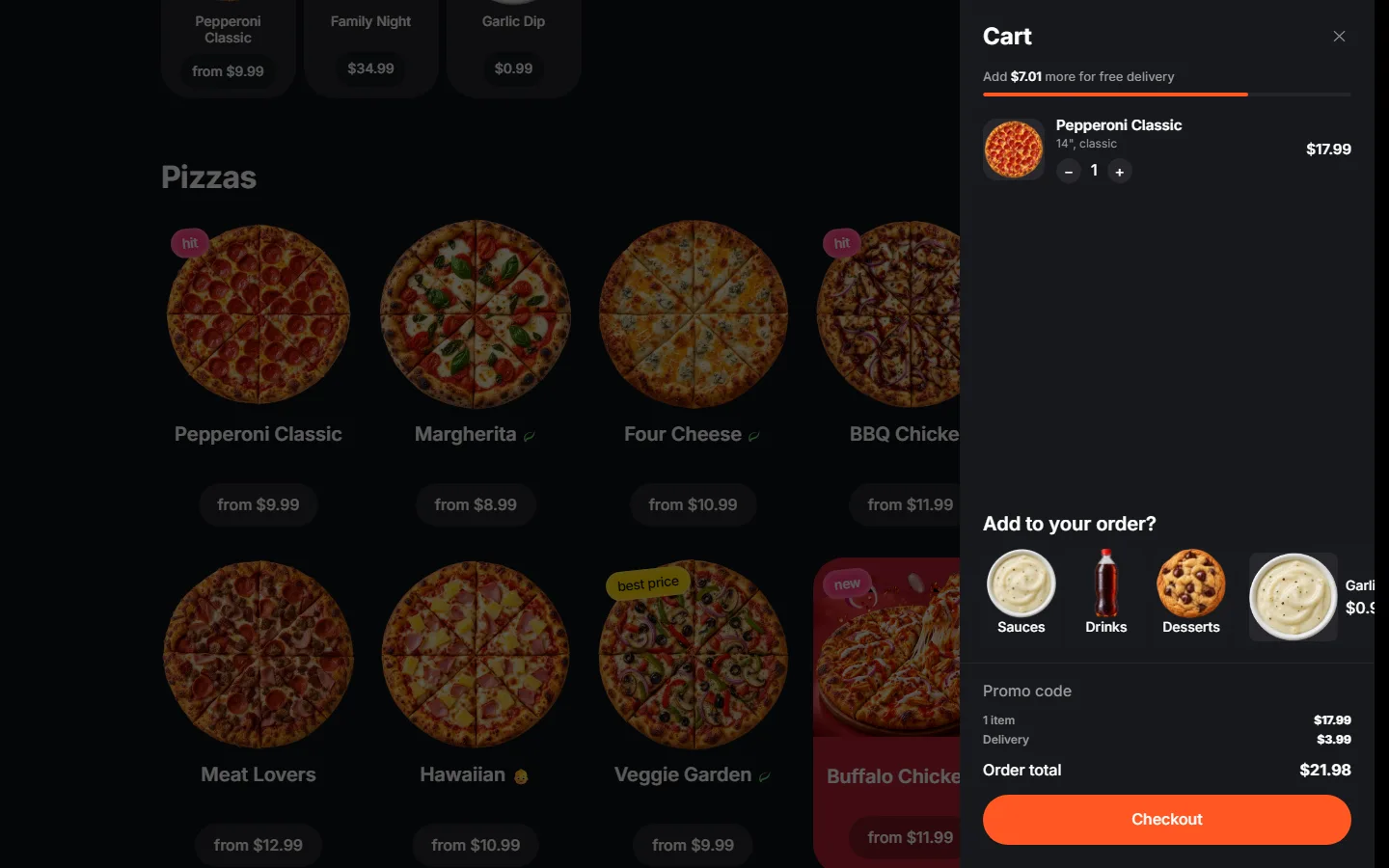
The cart opens as a drawer on the right and keeps the catalogue behind it. Quantity changes in place, the total updates as you go, the line above the button says how much is left to free delivery, and sauces and drinks are offered right there in a single tap.
A footer built for a network, not one point
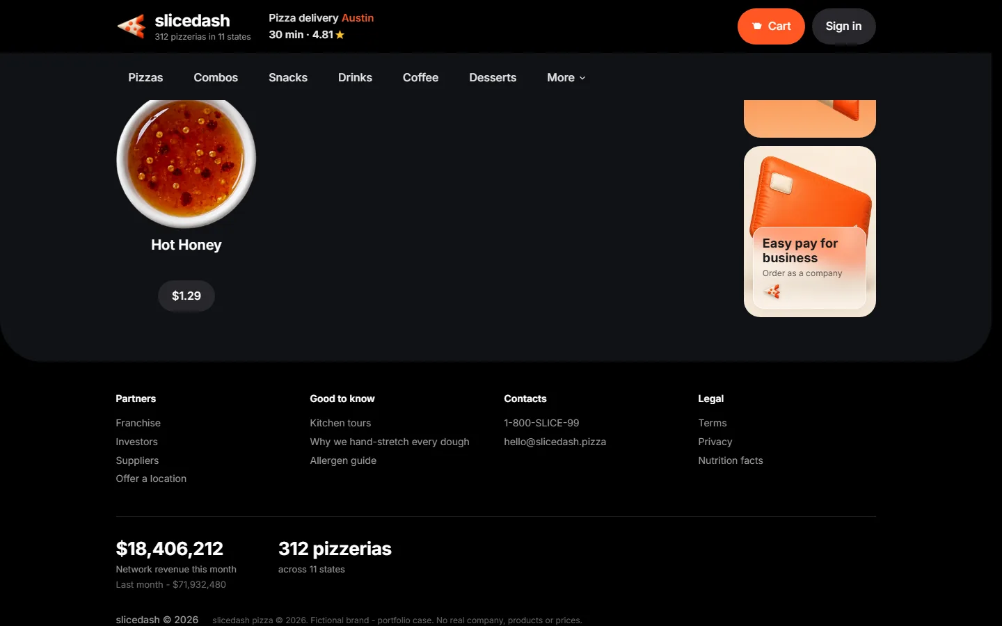
The foot of the page carries what a growing chain needs somewhere: franchise, investor and supplier links, an offer-a-location form, a section about the kitchens and the allergen guide, then phone, email and the legal documents.
Under that the brand publishes its own figures, the number of kitchens and the states they cover. Dark background, white type and one accent colour hold the page together, and the food photography does the rest.
Under the hood
This is a demo storefront, so the technical part says plainly what is wired up and what is not. Two languages, the search block in the head, the cart in the browser and the checks on a phone.


Search and AI answers
English and Brazilian Portuguese
The Portuguese version is its own page at /pt-br/ with prices in reais, while the English one keeps dollars. Open the Portuguese version
A head written for search
Title, description and canonical are set on both language versions, and the title and description are short enough to show in full in a search result.
Link previews in messengers
The head carries an og:image and twitter:card set to summary_large_image, plus favicons and a web manifest.

Catalogue and cart
The menu is one data file
Fifty-two dishes and twelve toppings live in a single JSON file that is compiled into the site at build time.
The cart lives in the browser
The cart and the promo code are kept in the browser storage, so a refresh or a closed tab does not empty them.

Payment
Checkout is a stub here
There is no payment provider behind the checkout button here, and it says so instead of pretending to take money: this page is a demo.

Mobile
Checked on a phone screen
At 390 pixels wide nothing runs off the side of the screen, so there is no sideways scrolling to fight.


Reliability
Clean on the best-practice check
Lighthouse gives the page 100 for best practices on mobile and on desktop, with no failing audits in that section.
Plain static files over HTTPS
The site is hand-written HTML, CSS and JavaScript with no framework behind it, served from a content network.
On a phone
What came out of it
- From picking a pizza to the cart in two clicks, without leaving the page.
- Size, dough and toppings are chosen in one window, with the price updating as you choose.
- The cart shows the free-delivery threshold and offers add-ons in the same drawer.
The site takes orders on its own, so the kitchen keeps the commission and the customer. The menu is data, so prices, photos and whole categories change without touching the layout.