The task
A design studio is judged by its site before anyone opens the portfolio. A template with stock photos says the studio buys its look somewhere, which is the opposite of what it sells.
The other half of the job is ordinary. The site has to show the work, say what the studio does, carry what clients say afterwards and collect a brief, all on one page.
What we built
The name across the screen and artwork of our own
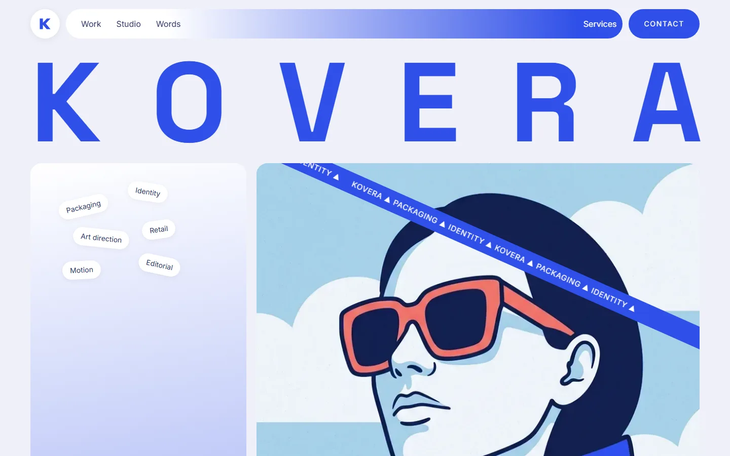
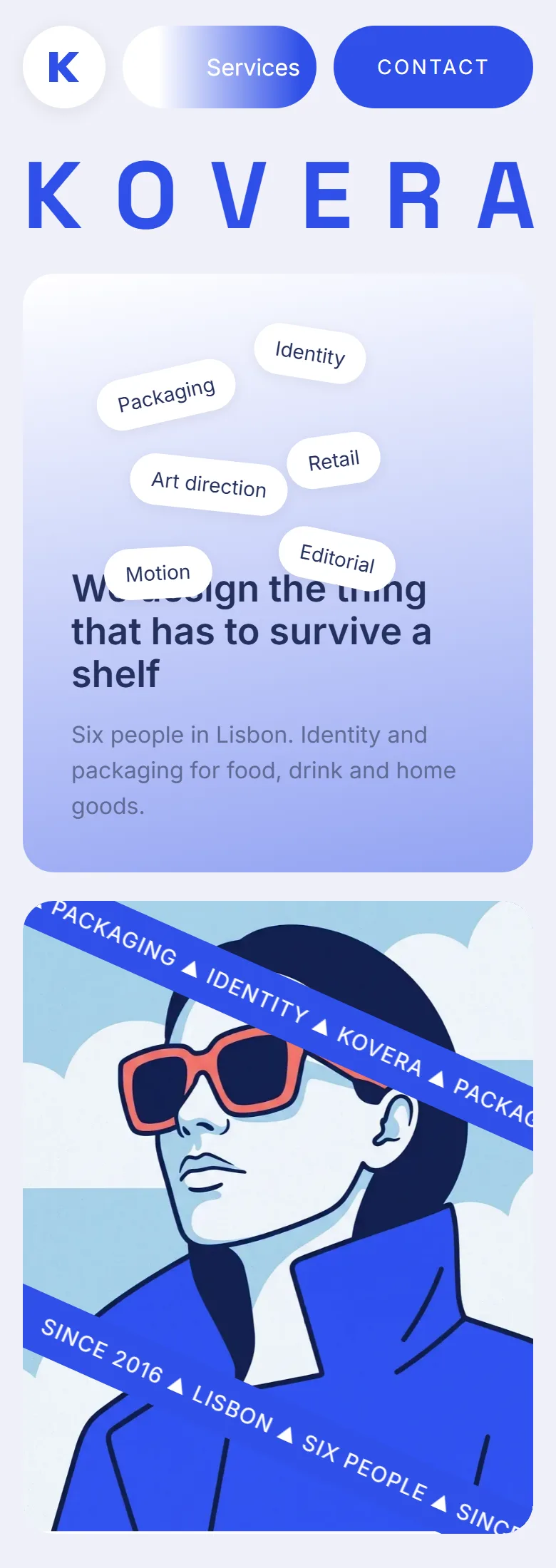
The first screen is the studio name set across the full width, letter by letter, in one blue on a pale ground. Under it two blocks: what the studio does, and a drawn portrait that sets the visual language of the page.
None of the images are bought. Portraits, the studio scene, the shop and the print spread are drawn in one palette and one line weight, which is what makes the page read as a piece of work.
Three projects instead of a wall of thumbnails
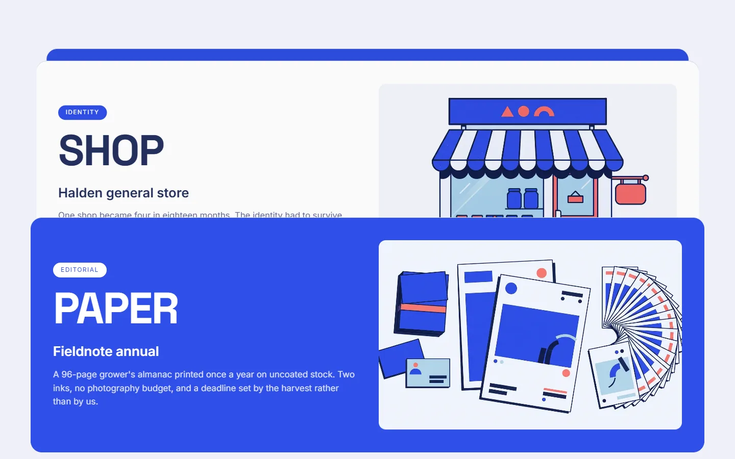
The showcase holds three cases, each on its own full-width card: a jam range, a general store identity, an annual printed on uncoated stock. A tag says the kind of work, a large word names the object, and two or three sentences say what the constraint was.
Three is enough. A studio that shows thirty projects is asking the visitor to sort them, and a studio that shows three has already chosen.
Reviews as drawn portraits
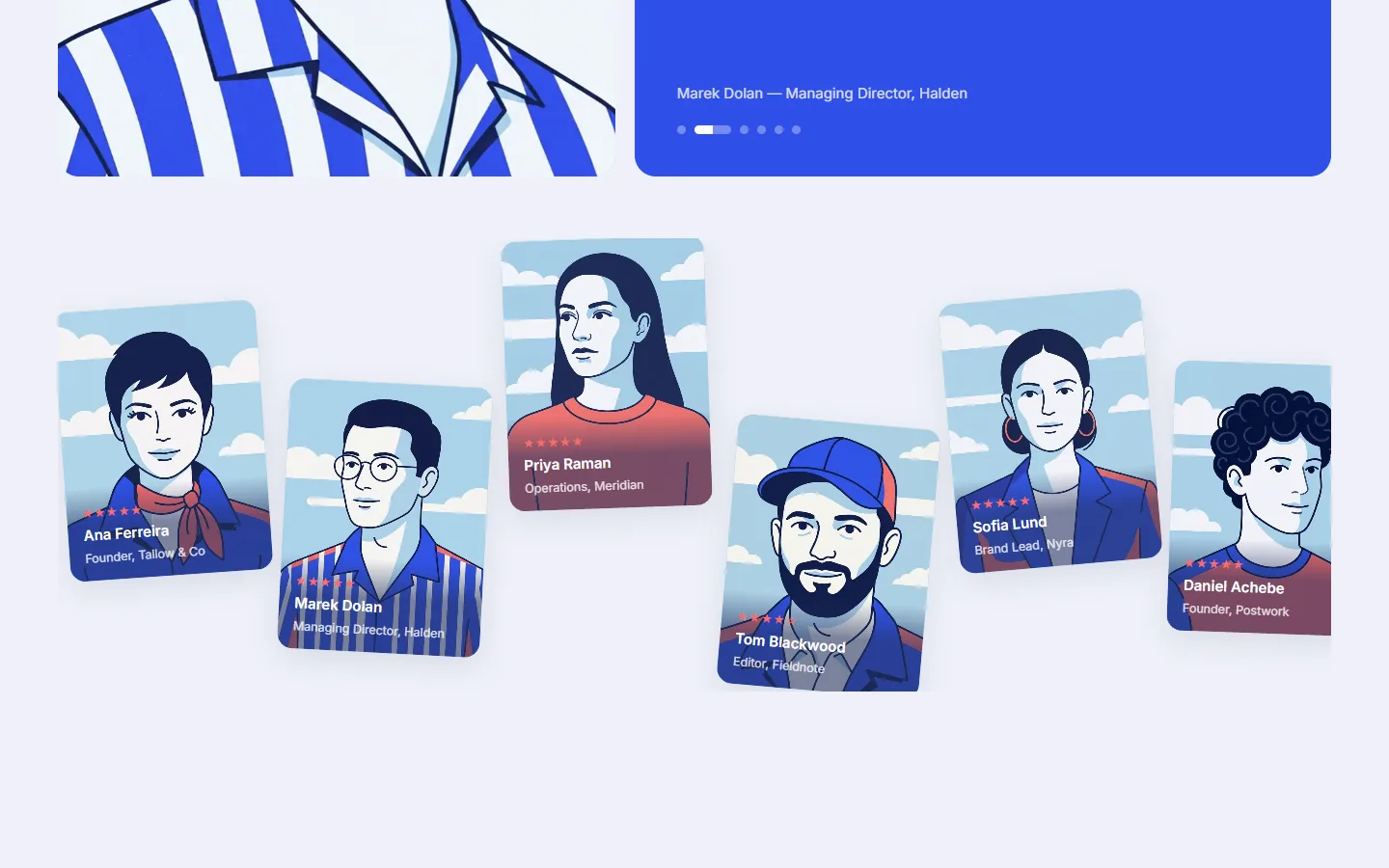
Client words run as a carousel, one review open at a time with the name and role under it. Below the carousel the same people stand as a row of tilted portrait cards, drawn in the same style as everything else on the page.
A portfolio site usually puts a stock photo next to a quote, which nobody believes. A drawn portrait makes no such claim and keeps the reviews inside the same visual language.
Services in plain words and a brief form
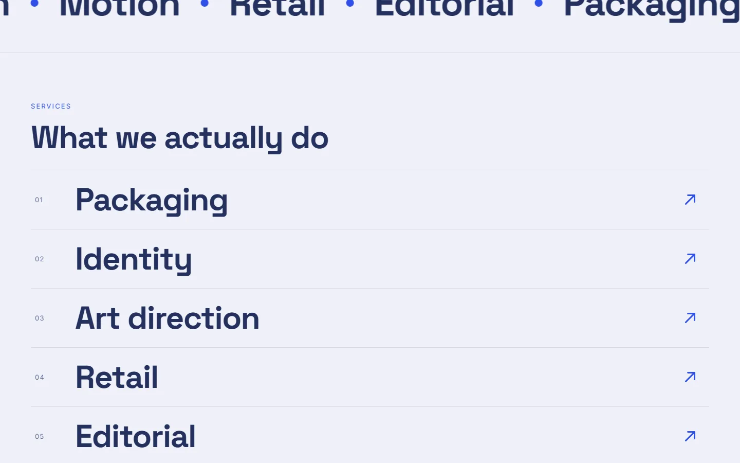
Services are a numbered list rather than a grid of icons: packaging, identity, art direction, retail, editorial. Each line says what the studio hands over at the end, which is what a client is actually buying.
The page closes on the brief. The form asks for a rough one and says the studio answers within two working days, and if the job is not for them they will usually say who it is for.
Under the hood
The page is hand-coded and checked by scripts before it goes out: contrast, console errors, the animations. Here are the checks and the numbers they produce.


Speed
Performance 98 on desktop
Lighthouse measures the desktop page at 98 for performance, with the largest element on screen in under a second.
The whole page is 730 KB
Everything on the page — the artwork, the type, the code — comes to about 730 kilobytes in 27 requests.
Logos drawn as vectors
The six company logos on the page are built as SVG rather than exported as pictures.
Nothing jumps while loading
The measured layout shift on mobile is 0.001, which is as close to nothing as the metric goes.


Accessibility
Accessibility 94 both ways
The accessibility check comes back at 94 on mobile and 94 on desktop: heading order, image descriptions, the names of buttons and fields.
Contrast checked by script
A script measures every text-on-background pair against the WCAG AA contrast level, and it runs across all seven brand palettes the site can be switched to.

Reliability
Console and animation checks
Before a release, a script opens the built page in a browser, collects any console error or failed request, and confirms the reveal animations actually fire.
HTTPS with no way back
The insecure address redirects to HTTPS, and the server sends an HSTS header with preload, so the browser stops trying the insecure one.

Search
Full marks for search and practices
Lighthouse gives the page 100 for SEO and 100 for best practices, on mobile and on desktop alike, with nothing failing in either section.

Mobile version
Checked on a phone screen
At 390 pixels wide the page is exactly 390 pixels wide, so there is no sideways scroll.
On a phone
What came out of it
- Work, services and client words on one page, and the brief goes from the same page.
- Every image on the site is drawn for it, with nothing bought from a stock library.
- A new project is added as one card, without touching the layout.
The site now does the first meeting on its own. A client sees how the studio thinks, reads three projects with their constraints, hears from people who have worked with it, and sends a brief from the same page.