The task
Finance software is bought by people who have already been sold something similar. A wall of features tells them nothing about the daily work.
So the page had to answer one question: what is on the screen after you connect an account. Show the interface, show what happens when data arrives, then let the visitor check the price and ask for a walkthrough without going anywhere.
What we built
The first screen says what the product does
Three words across the whole width, Plan Save Grow, and under them one sentence about connecting banks, cards and the invoice inbox. The rest of the screen is the interface: two phones with the cash balance and the weekly chart.
The product figures the company publishes about itself sit on the dark strip right below, so the visitor gets the claim and the proof in the same scroll.
The product shown screen by screen
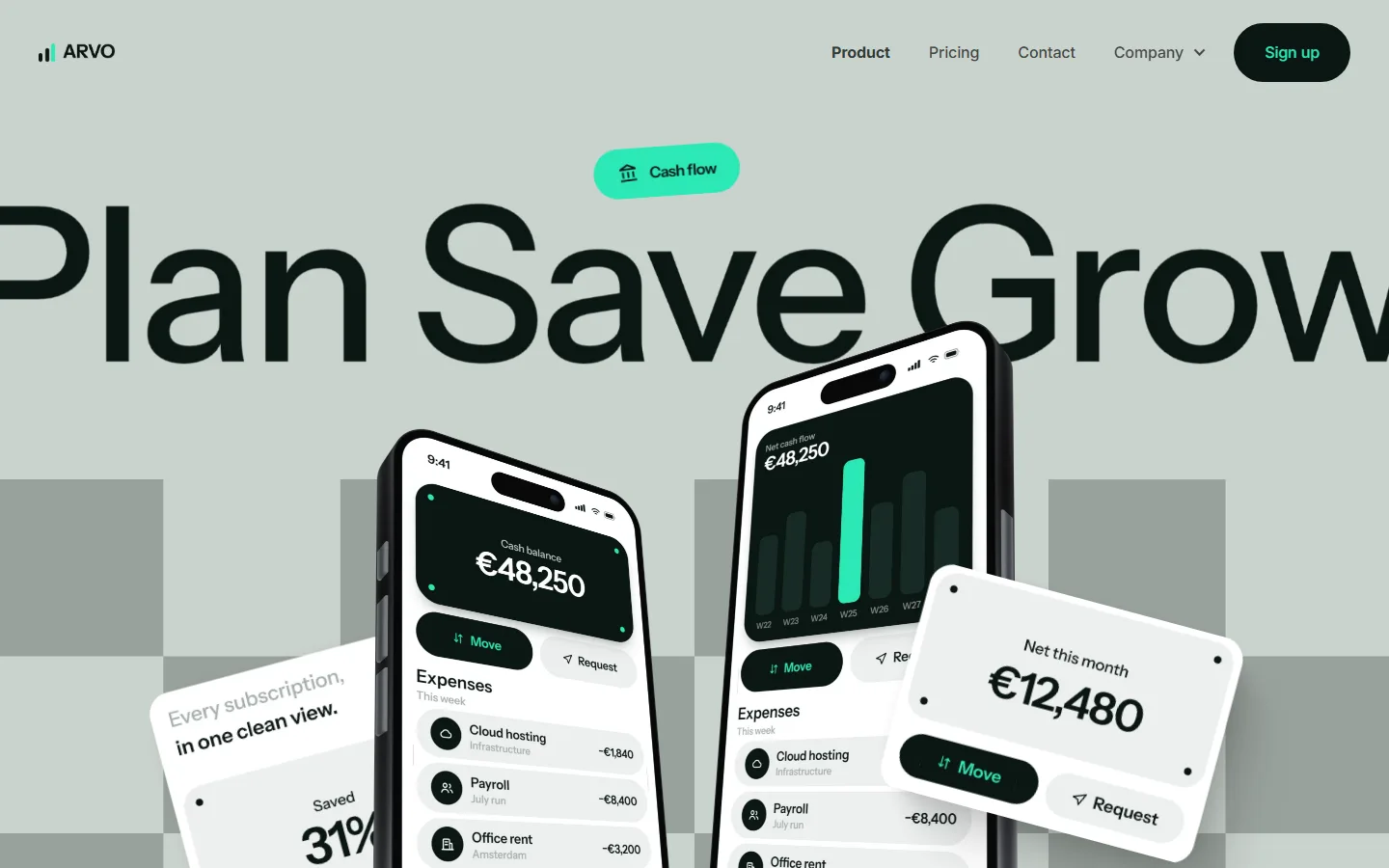
The overview block takes the promise apart. Connect the accounts once, and the product sorts each line as it arrives and says what the month costs before the month is over. The screens beside the text show exactly that.
A short walkthrough follows the same order the user does. Set the workspace and cost centres, invite whoever approves spend, point the product at the bank feed and the invoice inbox, and watch the categories fill in.
Reviews from the people who sign off on spend
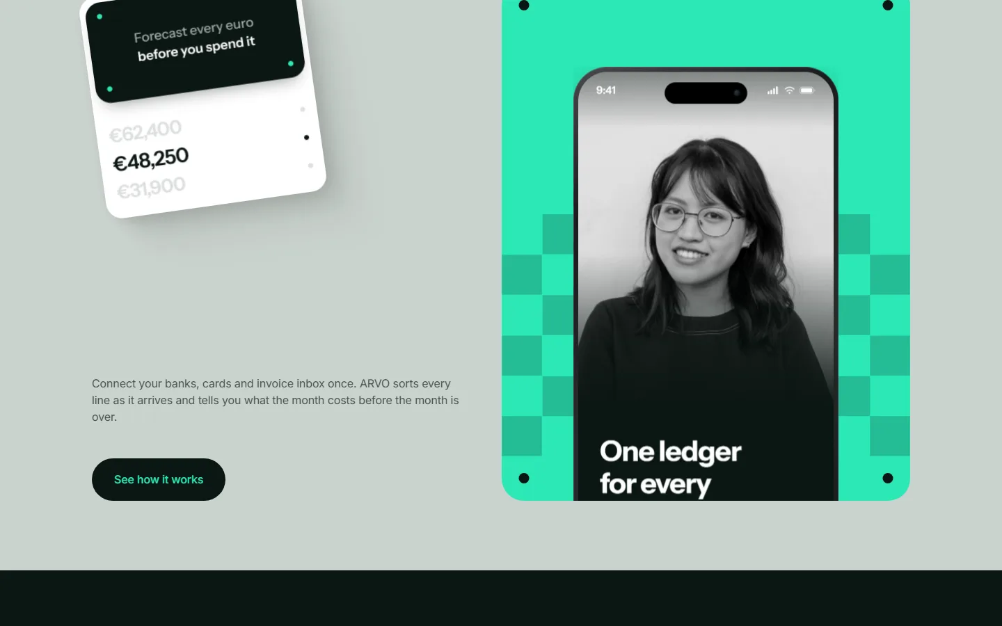
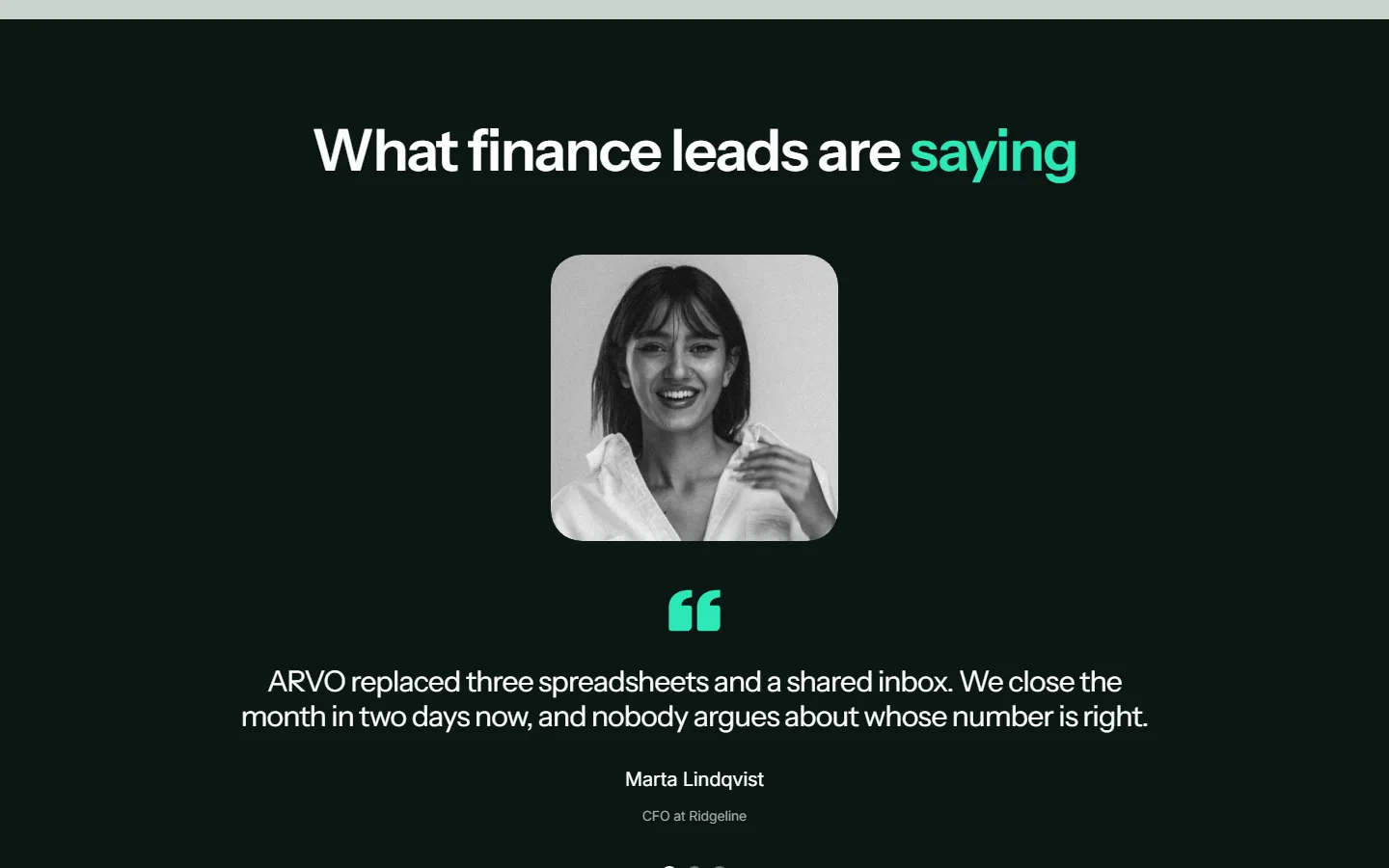
The reviews block is a slider with one review on screen at a time: a portrait, a few sentences and the name and role of the person. Finance leads talk about what changed in their week, not about how the product feels.
One at a time is deliberate. Three quotes side by side get skimmed as a pattern, while a single one gets read.
Plans and the demo request on the same page
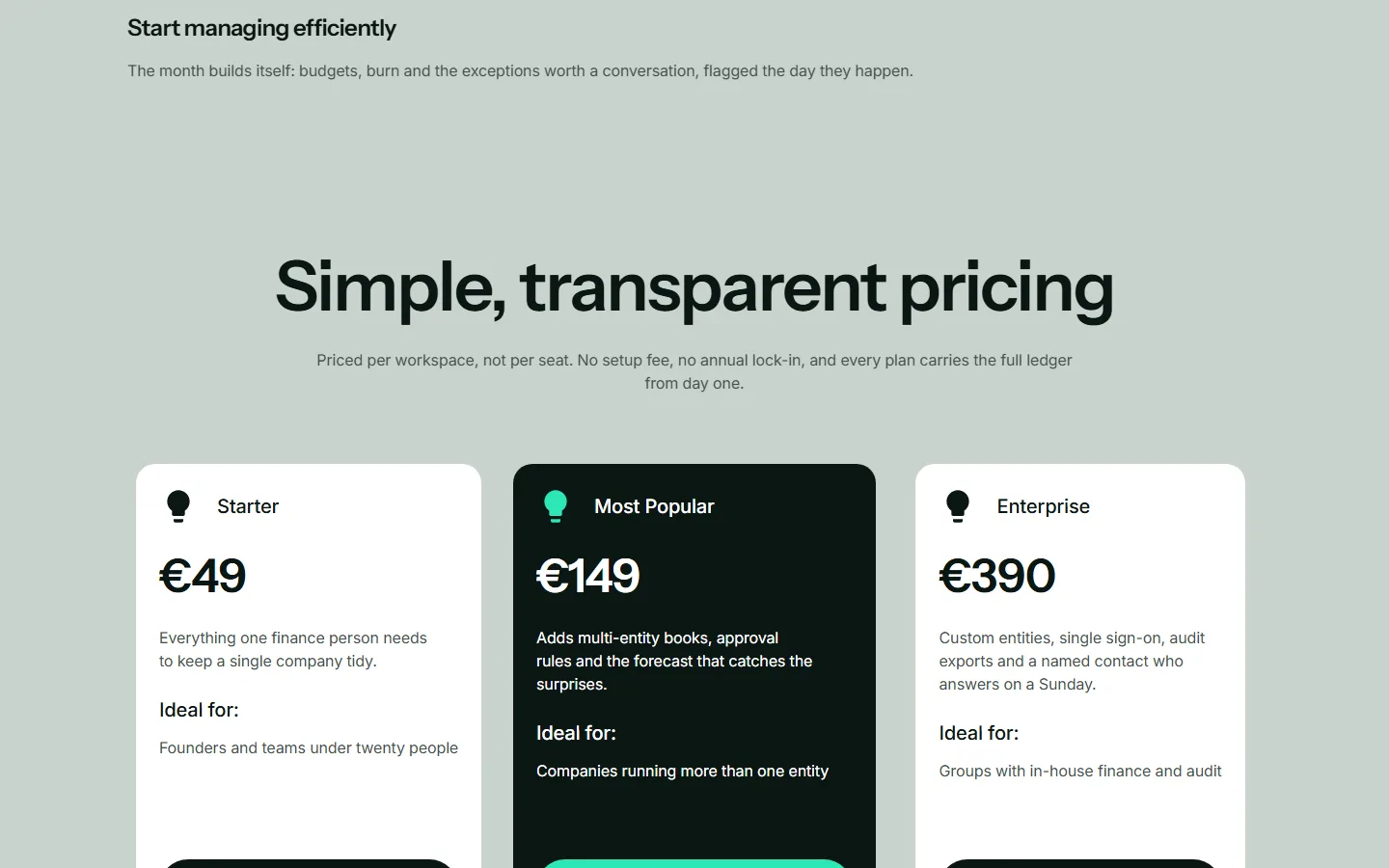
Three plans stand side by side, priced per workspace, with the middle one marked as the popular choice. Each says what it adds to the one before it and who it suits, so the visitor picks a row rather than compares a matrix.
The closing block asks for a walkthrough on the visitor's own data instead of a slide deck. The pricing questions live on the pricing page, and the header keeps sign-up within reach the whole way down.
Under the hood
The site is a bought template rebuilt into the brand, and the rebuild runs from a script rather than by hand. Here is how that works, and what the page measures at.


Lighthouse scores
Performance 98 on desktop
Lighthouse measures the desktop page at 98 for performance, with the largest element drawn in about one second.
Accessibility 96 both ways
The accessibility check comes back at 96 on mobile and 96 on desktop: contrast, heading order, image descriptions and the names of buttons and fields.
Full marks for search and practices
Lighthouse gives the page 100 for SEO and 100 for best practices, on mobile and on desktop alike, with nothing failing in either section.
A snippet that fits
The title is 36 characters and the description 119, so both show in full in a search result instead of being cut mid-word.


Security
HTTPS with no way back
The insecure address redirects to HTTPS, and the server sends an HSTS header with preload, so the browser stops trying the insecure one.

Privacy
Nothing tracks the visitor
There is no analytics script, no tag manager and no advertising pixel on the page.

Mobile version
Built for a thumb
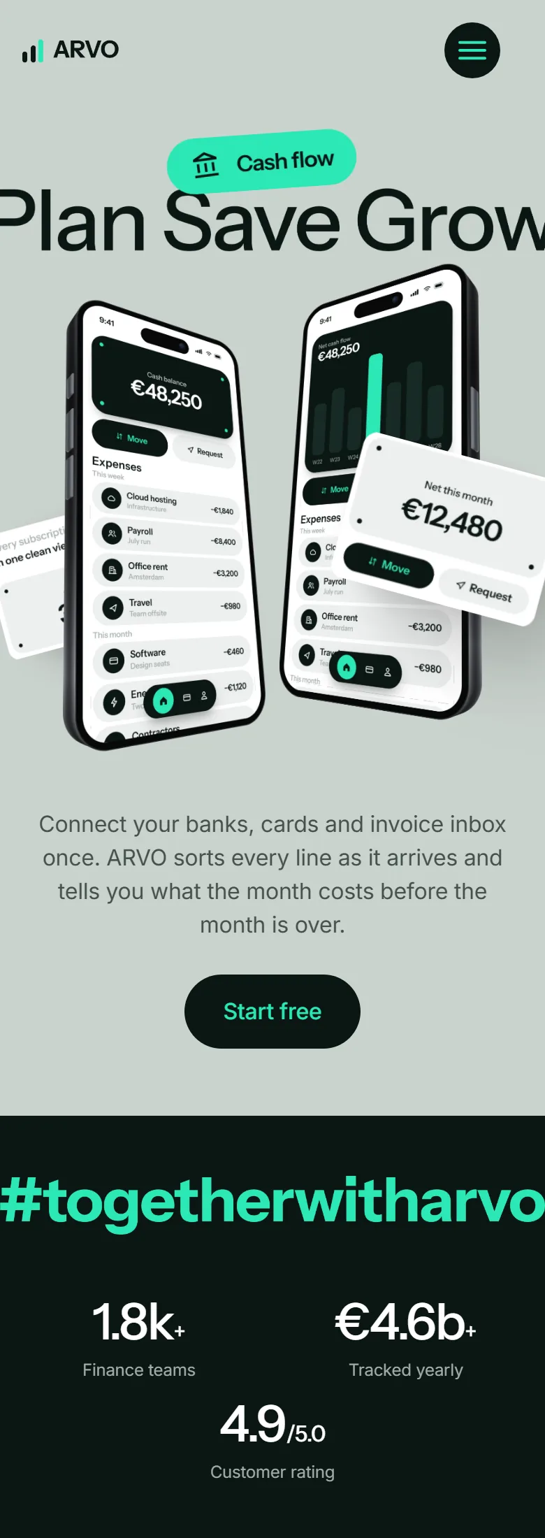
At 390 pixels wide the page is exactly 390 pixels wide, so nothing runs off sideways.


Build process
The rebrand runs from a script
The template source is kept untouched, and a script applies 107 replacement rules over it to produce the branded site: names, colours, type, images, links.
On a phone
What came out of it
- You can see how the product works before signing up.
- The interface, the onboarding steps, the plans and the demo request live on one page.
- Every claim on the page has a screen next to it.
The site takes the visitor from the first sentence to the sign-up button without a call in between. It shows the interface, walks through the first afternoon of use, gives the price and offers a walkthrough on real data.