The task
Payment infrastructure is hard to sell from one screen. The buyer is a payment provider or a fintech, and before writing to anyone they want to know what the gateway covers, whether it fits their case and how the integration starts.
So the page had to do the explaining. We laid the product out in blocks and gave each block one job: what the gateway does, who needs it, how to connect. There is nothing to photograph in payment infrastructure, so every image on the page is our own 3D render.
What we built
The first screen of a payment gateway website
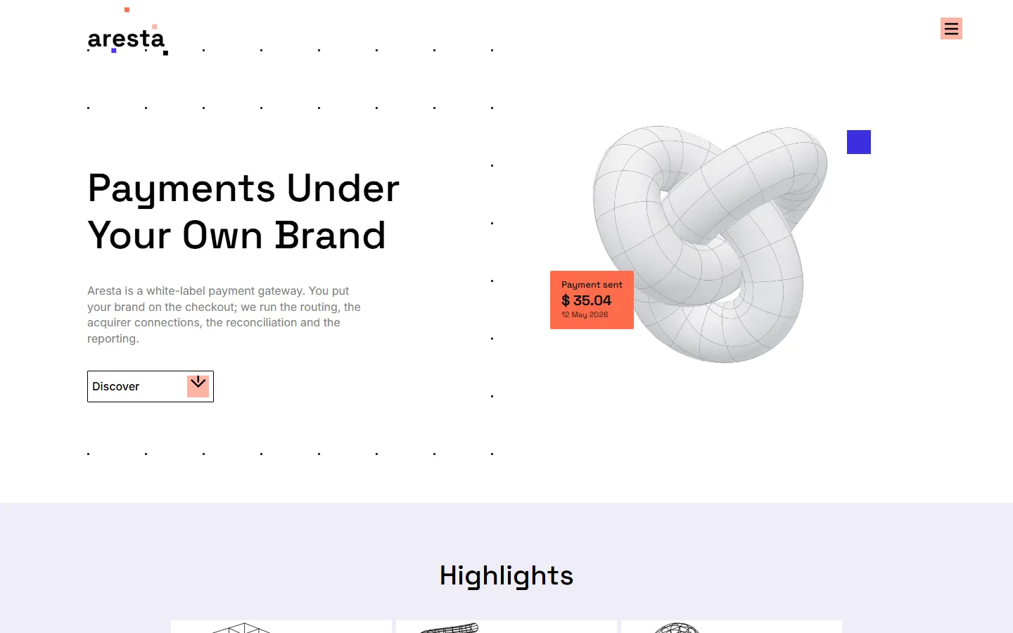
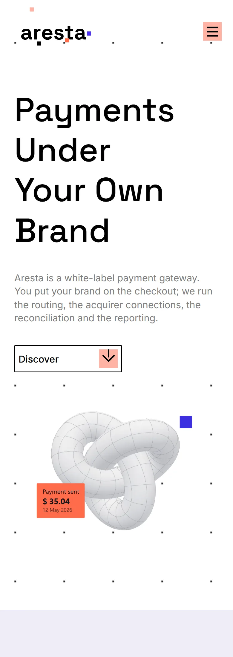
The page opens with the offer in plain words: payments under your own brand. One paragraph under it says what the gateway is and what it takes off the client’s hands.
Beside the headline is a 3D object with a small card showing a payment going through. One button leads down the page, and everything needed for a decision is on that page, so there is nowhere to get lost.
What the gateway does, block by block
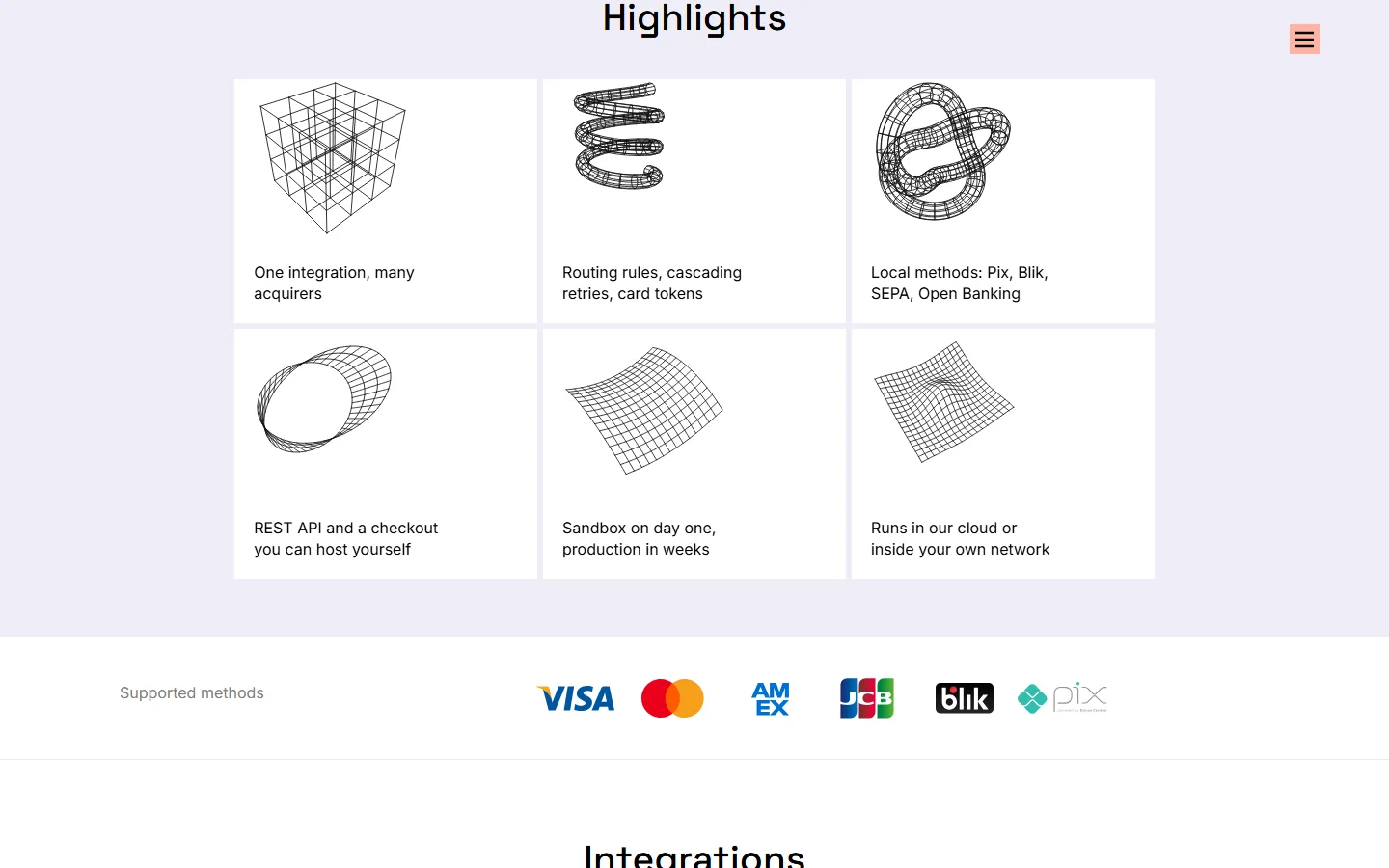
The next block lists what the platform covers: one integration for many acquirers, routing rules and card tokens, local payment methods, a REST API and a checkout the client can host. Card scheme logos sit under it, so the coverage is visible without reading a table.
Below that, nine short cards go through acquiring, local methods, routing, risk checks, the merchant back office, white label, the developer side, onboarding and where the platform runs. Each card is two lines, so a payment provider can scan the whole product in a minute.
Who needs a white-label gateway
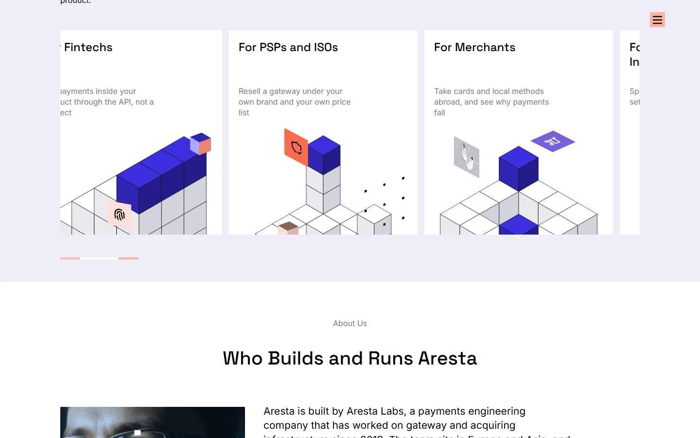
Four audiences get a card each: merchants taking payments abroad, high-risk businesses spreading volume across acquirers, fintechs putting payments inside their product, and providers reselling a gateway under their own brand.
The block under it says who builds and runs the platform, with named contacts. For a product like this that matters as much as the feature list, because the buyer is choosing a supplier and not only software.
Own 3D graphics instead of stock
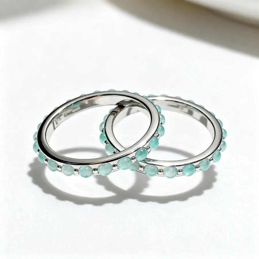
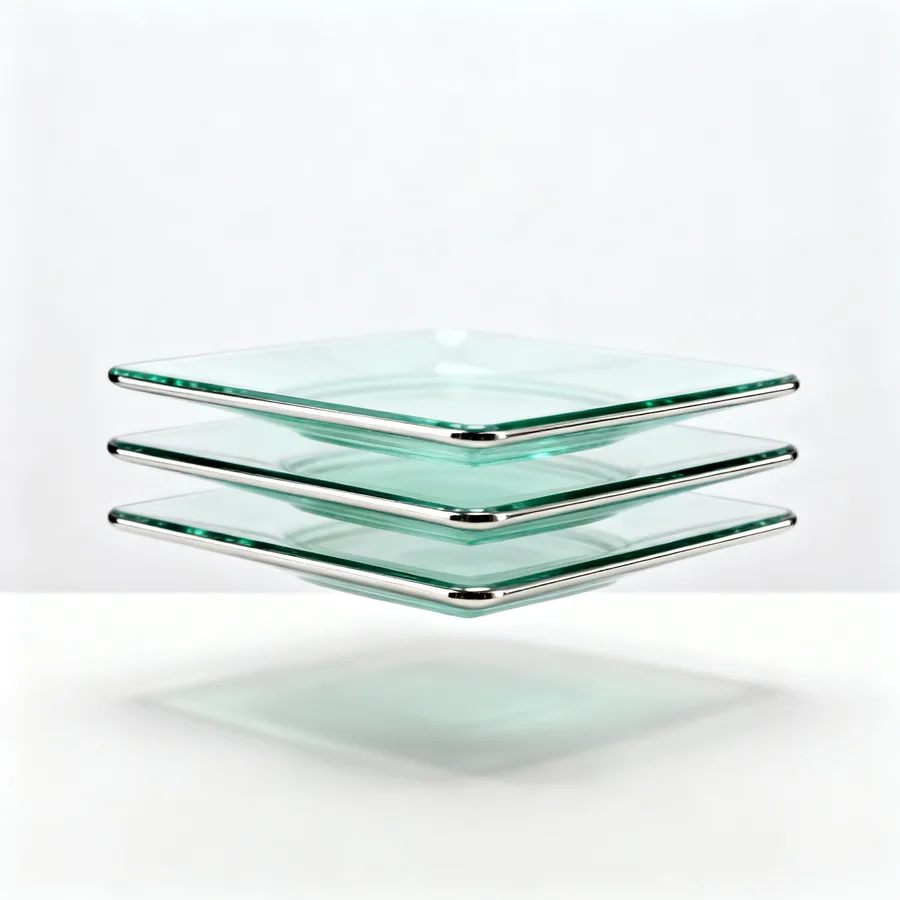
The whole page runs on graphics we made: wireframe objects in the highlights, isometric scenes beside the capability blocks and inside the use-case cards.
They share one palette and one light, so the site reads as one piece rather than a set of found images. It also means the client owns every picture on the page.

Under the hood
Below is what was measured on the live page: how fast it opens, what a search engine and a messenger read from it, and what happens after someone sends the form.


Speed
Opening speed, measured
Lighthouse gives the page 97 out of 100 for performance on a phone and 100 on a desktop.
Vector graphics, loaded late
Of the 58 images on the page, 43 are vector, so they stay sharp on any screen.
How it behaves on a phone
On a 390-pixel screen the page fits its width and there is nothing to scroll sideways.

Search and previews
What a search engine reads
In the SEO section of Lighthouse the page scores 100 out of 100 on both mobile and desktop.
The link opens as a card
A link to the site pasted into a chat opens as a card with a picture, a heading and a description.

Reliability
Both forms are shielded from bots
The two enquiry forms sit behind Cloudflare Turnstile.
Nothing follows the visitor
The audit found no analytics, advertising pixels or tag managers on the page.
The connection is encrypted
A request over plain http is redirected to https, and the browser is told to use https for the next two years.
On a phone
What came out of it
- A complex B2B product explained on one page
- The enquiry is two clicks away from anywhere on the page
- Every image is our own 3D render, no stock photography
The page now handles the first conversation. A payment provider reads what the gateway covers, finds their own case among the four, sees who runs the platform and writes from the same screen. Nobody has to explain the basics on a call any more.