The task
A bureau this size is chosen on the strength of the work and the way the practice is run. So the site had to hold three things at once: what the buildings look like, how the process goes from the plot to the keys, and who is actually going to be on the phone.
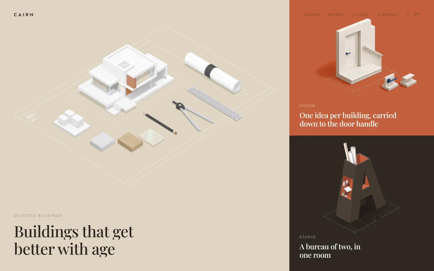
The reference was a site the owner rated as the most expensive-looking thing on the web. What had to be taken from it was the mechanics — the animation between screens and the elastic border under the cursor — and nothing else: own subject, own artwork, far fewer pictures.
What we built
Eight screens that turn, instead of one page that scrolls
The front page is split into three blocks — the work, the way of working, the people — and each block is a door. Click one and the screen is wiped over by a shape in the colour of the section that is arriving, so the move reads as one animation rather than as a page load.
Inside a section the screen never closes. The wheel steps through the content, and only at the end of it does the next section come. The border between the blocks bends towards the cursor and springs back when it leaves.
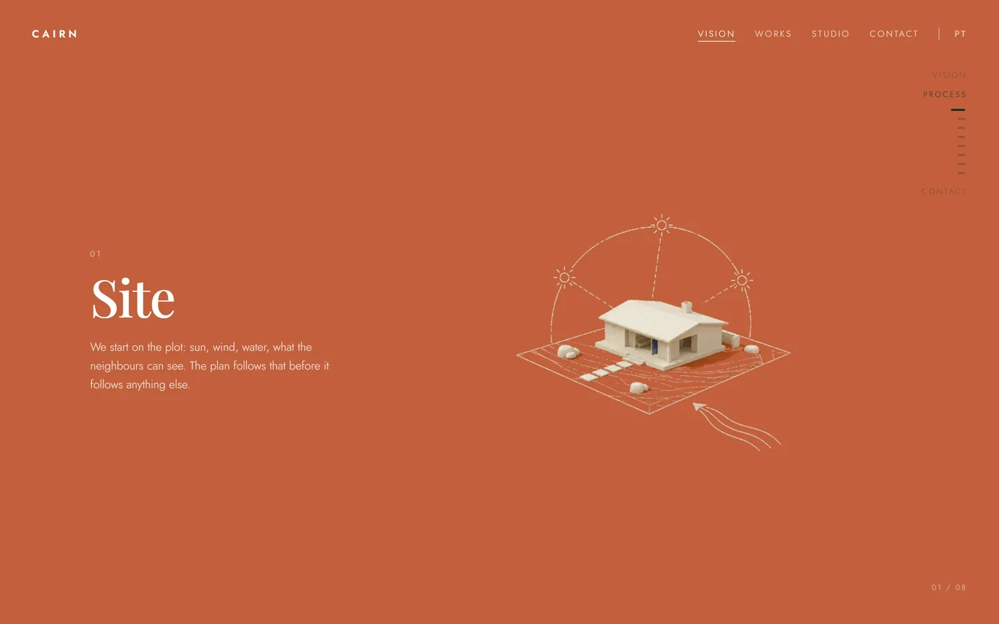
The process as eight steps, one to a screen
Site, brief, sketch, permission, drawings, tender, on site, handover. Each step gets a whole screen: a number, a name, three lines of text and a small scene beside it, and the wheel moves from one to the next.
This is the part a client actually reads before they choose a studio, because it says who does the arguing with the council and who answers on site. A list would have been read as boilerplate; one step at a time is read.
Six buildings, each one taking the screen in its own colour
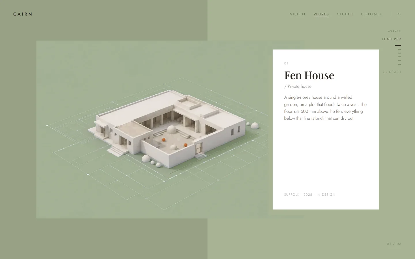
A project is not a tile in a grid here. It gets the whole screen: the building on the left on a field of its own colour, a white card on the right with the name, the type, four lines about the decision that shaped it, and the county, the year and the stage it is at.
Turning to the next project changes the background colour of the section, and the header switches between dark and light with it, so a dark project does not swallow the menu.
The people, and one way to write
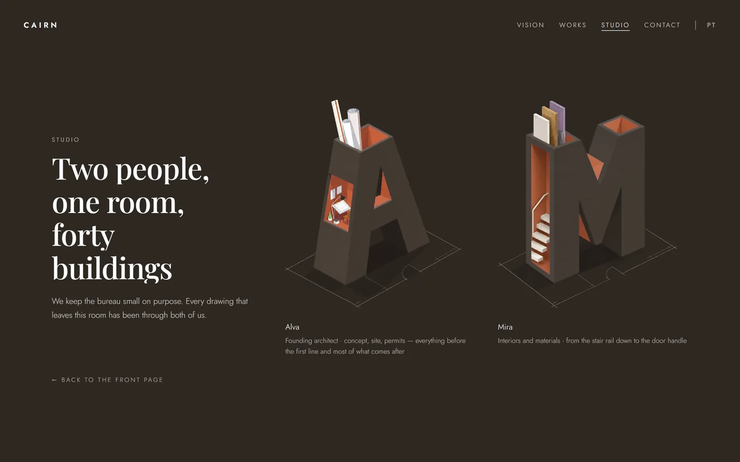
The two people of the bureau are drawn as their own initials, opened up like a building in section, with the room and its contents inside the letter. It is the same trick as the blocks on the front page, and it means a small practice does not have to put up two stock portraits.
The contact screen is a strip of colour with an elastic border on either side, one line of text and one button that opens WhatsApp. No form, no address to copy out — the address of the bureau and the studio credit sit in the footer and nothing else competes with the button.
Under the hood
Everything here is written by hand and measured rather than eyeballed. Here is what the numbers say about the speed, the transition, the second language and the phone.
Speed and reliability
96 for speed on a site that animates
Lighthouse measures the desktop page at 96 for performance: the main image is on screen in 1.4 seconds, blocking time is zero and layout shift is zero.
Full marks for accessibility and practices
On desktop Lighthouse gives the page 100 for accessibility and 100 for best practices.
Checked on the live address
Both versions were walked through on the live site, on desktop and on a phone: no JavaScript errors, no failed requests, no image that fails to load.
Stack and transition
Static, written by hand
No framework and no build step: HTML, CSS and JavaScript written by hand, plus two small libraries for the text and the timelines.
One transition file, five angles
The wipe between sections is a single animation file, turned to a different angle for each destination — nine copies of it would have cost 285 KB for nothing.
Second language
The second language costs 27 KB
The Portuguese version is a page of its own that shares every stylesheet, script, image and animation with the English one, so the whole second version weighs 27 KB. Open the Portuguese version
Mobile version
The phone gets a layout of its own
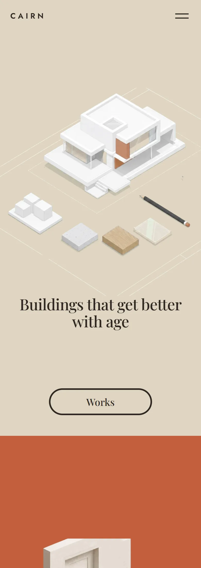
On a phone the eight screens become a ribbon of ten, nothing is wider than the screen, and the header keeps one logo whose colour is picked from the brightness of the background under it rather than from the name of the section.
Own artwork
Eighteen images of our own, cut into layers
The buildings, the letters and the small scenes of the process are generated to one style lock, then cut so that each object sits on its own layer and drifts on its own.
On a phone
What came out of it
- The whole bureau fits into eight screens, and every move between them is one animation.
- The eight steps of the process are read one at a time instead of skimmed as a list.
- The same site runs in two languages, and a Portuguese-speaking visitor opens the Portuguese one without asking.
- Lighthouse measures the desktop page at 96 for speed, with no layout shift at all.
The site works the way a bureau of this kind sells: it shows the buildings, explains who does what between the plot and the keys, puts a name to the two people who will answer, and ends on a single button. A visitor who has gone through the eight screens already knows how the practice is run before the first message.